Typography II
Rather than having a focus on typography itself, in Typography II, there was a focus on type composition, meaning where type would go, and how to make sense of it when reading. To achieve this, we first created a template for our resumes, to be seen on Computer, iPhone, and Tablet. We then created a small booklet comprising of both type and shapes for our second project. We finally composed and made an actual booklet for our final project.
Typography II had 3 Projects
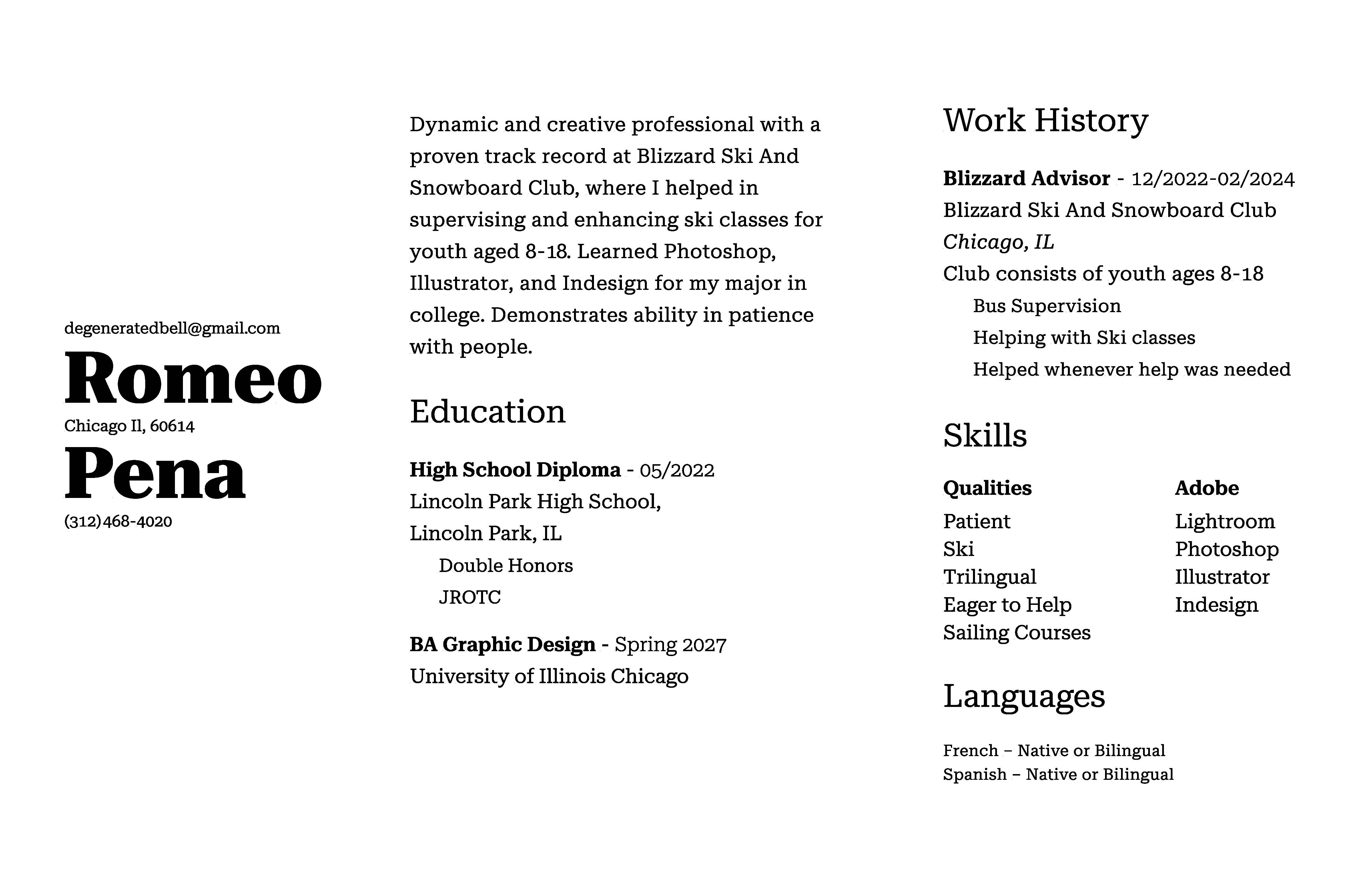
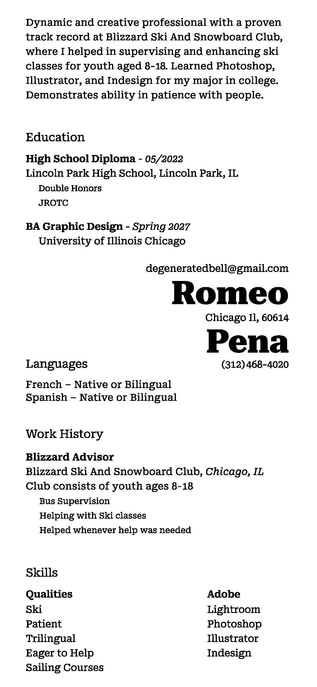
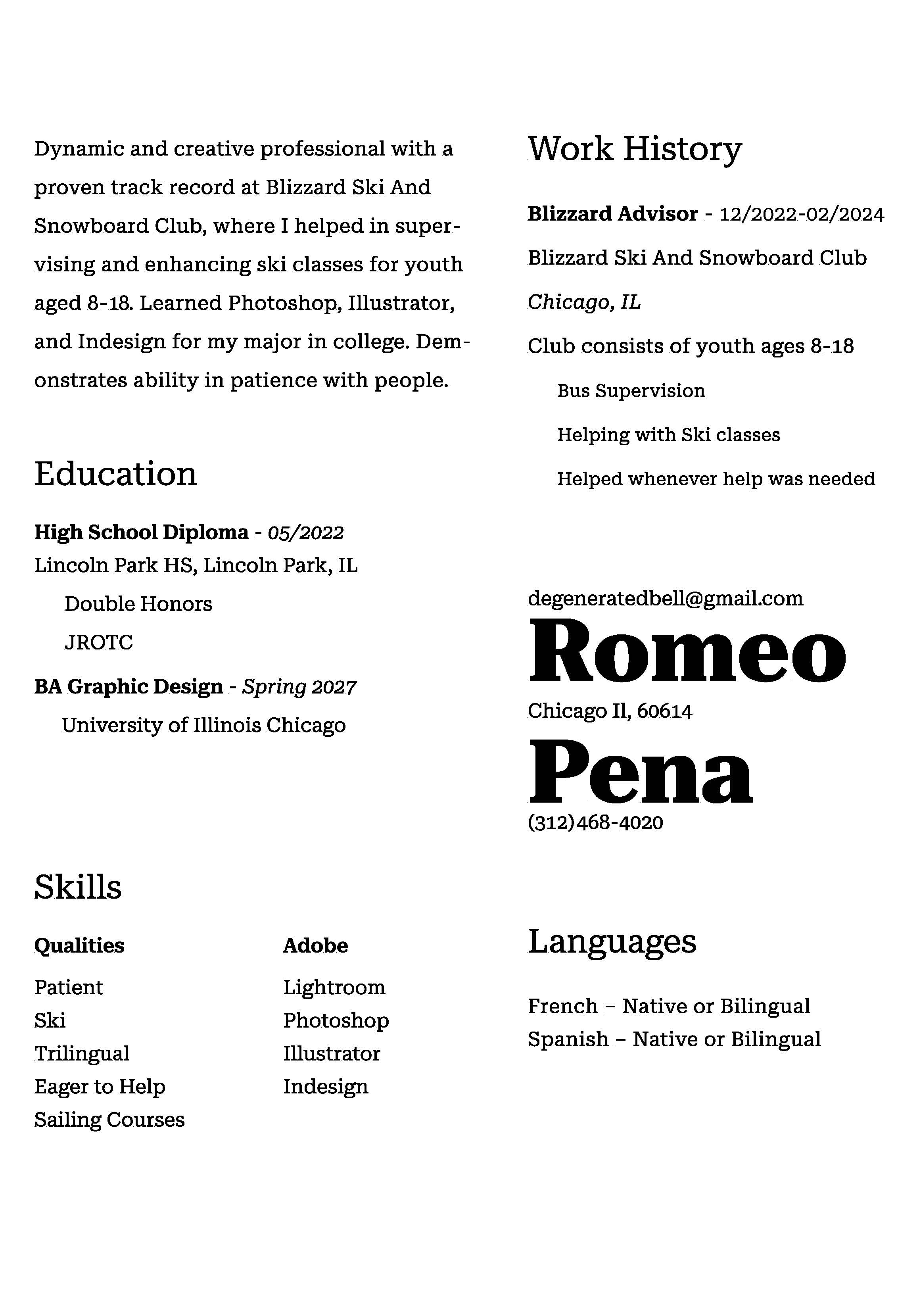
Project 1 - Digital Resume
We had to create our resumes using InDesign, and create a nice composition of our choosing on 3 different viewing platforms; computer, iPhone, and tablet.
Project 2 - Grid Exercises
Before beginning to work on the main project, we were testing different ways of creating grids, by positioning vertical and horizontal lines in a box.
Repeating this over and over, we then moved to filling some areas in between the lines, to create shapes within the grid, and therefore a composition. From little to little, adding more and more.
Repeating this over and over, we then moved to filling some areas in between the lines, to create shapes within the grid, and therefore a composition. From little to little, adding more and more.
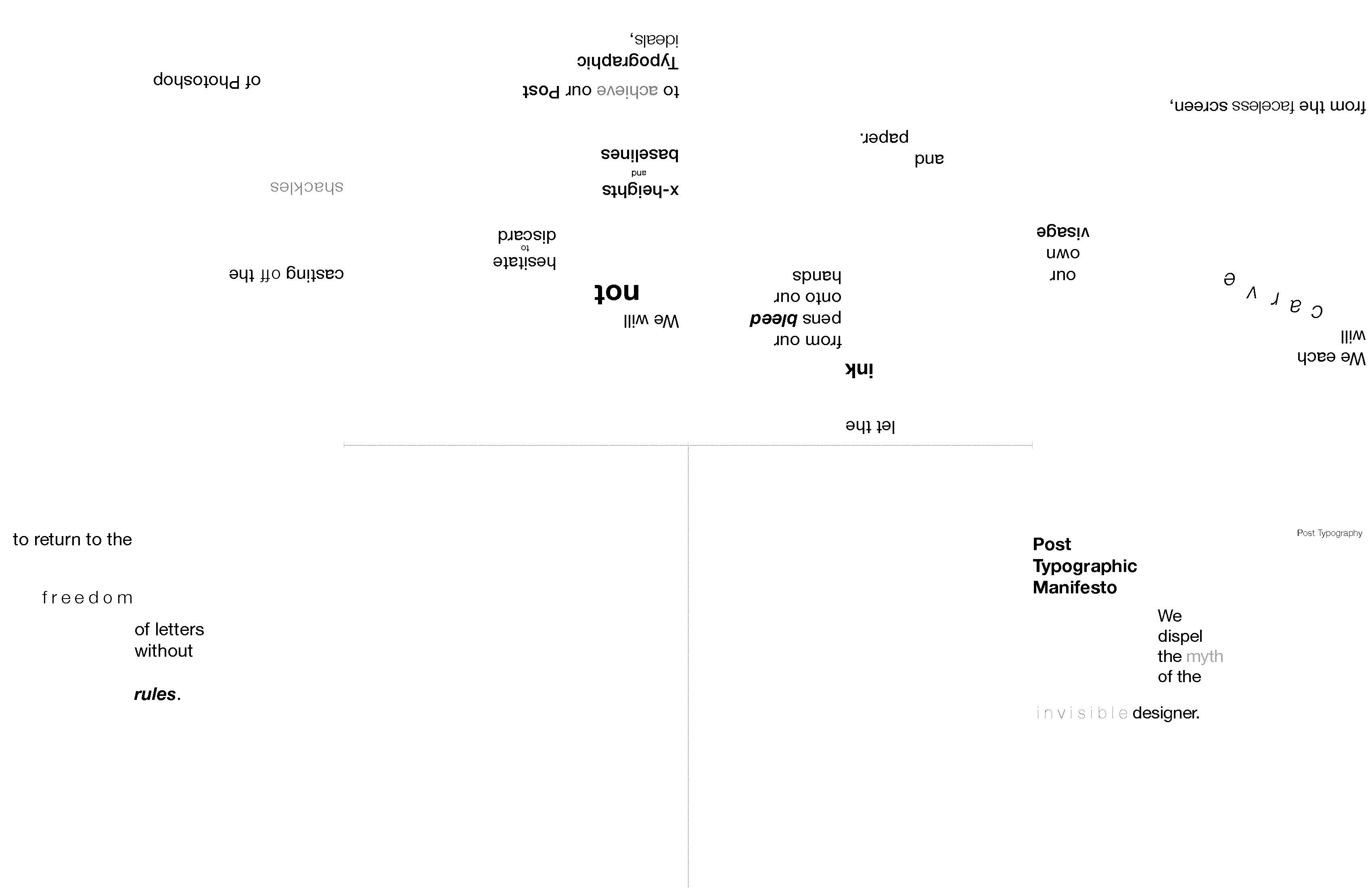
Project 2 - Grids
For the actual project, we started with the same as before, where we created a grid that we were satisfied with, and then filled some areas to create our main composition. Afterwards, we would then position text, form the "Post Typographic Manifesto", and create a typographic composition.
Using the same grid composition for each page, we created a small flippable booklet using one of the quotes from the "Post Typographic Manifesto".
Using the same grid composition for each page, we created a small flippable booklet using one of the quotes from the "Post Typographic Manifesto".
Project 3 - Book
For the final project of Typography II, we were given an interview between 2 people and had to create the typographic composition of where each person's line went. We first focused on the composition itself, and then added shapes, colors, and images to make our final book composition. Here is the process for the first chapter of the book I made.